BuildingGreen Icon Set
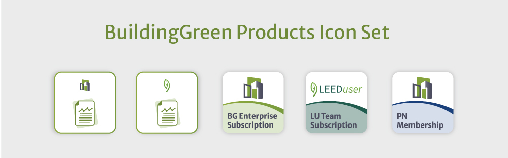
Icons played a key role in shaping the UI design. I created distinct icon sets tailored to the needs of each platform: the broader BuildingGreen website, the PeerNetwork Community forum, and the checkout experience.
Across sections like pricing and checkout, these icons helped visually connect users to content, while in areas like feature listings, they reinforced the branding and drew attention where it mattered most. In the checkout specifically, product icons built trust by visually differentiating each subscription through distinct logomarks and colors. As an integral part of the broader brand identity, the icon set was applied consistently across the website and other digital touchpoints.
BuildingGreen Icon Set

BuildingGreen Community Icon Set

BuildingGreen Products Icon Set